E-commerce checkout experience - Lulu and Sky
How to improve an E-Commerce Checkout Experience
The checkout process is an important aspect of any e-commerce website. In this case study, I will explain how I revamped the checkout process to improve the sales and conversion rate of the users.
My Role
UX Researcher, UX Designer, Interaction Designer, UI Designer
Tools
Sketch, Figma, InVision, Zeplin, Sticky Notes, Pen & Paper, Airtable, Draw.io
Team
Myself, Founder, the business development manager, and a developers
Duration
6 weeks
UX Techniques Used
Competitive/Comparative Analysis, User interviews, Mind Mapping, Card Sorting, User Personas, Site Map, User Flows, Wireframing, Prototyping, Usability Testing
Process

In order to boost the sales of an e-commerce website, we want the users to have a hasslefree experience from cart to checkout in order to have a higher conversion rate.
"Here are few things we should really think while talking about an e-commerce website and conversion rate:.."
• Why do some users face problems in performing a successful checkout at an e-commerce website? According to Baymard Research — the global average cart abandonment rate currently sits at 69.2%.
• What motivates them to make a purchase?
• What causes frustration in a new or a frequent user which can negatively affect their conversion rate?
• Are you asking them too many details during the checkout process?
Your customer has decided to make a purchase from your website. Come on! You need to make their experience simpler.
Okay, now that I have put across some thoughts about how important the checkout process is, let me walk you through this case study for improving the experience for the users who use the e-commerce platform.
Existing problems on the website
There were two major concerns on the website:
1. High user drop off rate: There were user dropoffs from the cart page to the shipping page. There was a further dropoff of users from the Shipping page to the Payment page. This leads to a low conversion rate.
2. Payment security: There weren’t any visual cues to address how secure the payment of the website was to ensure that the customer's money is safe and is sent through a secure payment gateway.
3. Long checkout process: The checkout process took a lot of time which also led to low conversion rates.
Research: Root cause of the problem
I observed the analytics data, user research data which was collected by the client from their users. It was important to understand WHY those problems existed on the website.
I wanted to do my research as well to get into the root cause of the problems.
How did I start?
1. I started off by doing a heuristic analysis of all the pages that the user has to go through to complete a checkout. This was done to uncover the problems during checkout, calculate the number of clicks required to place an order and find out potential usability issues.
2. I did some competitive analysis to understand the common trends of a fast checkout experience.
3. Conducted multiple interview sessions with stakeholders who directly spoke to the customers to understand the problems they are facing with the current checkout process.
let’s dive into the redesign solutions page by page.
Cart Page
The content on this page needed visual rearrangement to emphasize on important product details like product name and price along with quantity as those are the most important details that the users are concerned about while reviewing their order in cart.
The following were two major problems observed on cart page:
First: Saving the cart for the future- Saving the cart functionality was provided right below the order summary. It looked like as if it was equally important as the order summary section. It seemed like it was fighting for attention along with the order summary section.
Saving the cart for the future is de-emphasized and shown in smaller font next to each cart item. Users can opt for this feature on each cart item. This was a common pattern for saving the cart functionality seen on other popular e-commerce websites like Amazon, Walmart.
Second: Use of coupons-Offers related to the cart products were flashing on the cart page but there was no provision to apply coupons.In fact, the coupon application was available only at the last step of checkout. This means that users have to memorize the coupon code and use it in the last step.
Solution: By having the coupon code option at the cart page itself we allow the users to see how much discount are they saving at their order. If a discount is shown on the cart page, we must make it easy to enter and apply those codes.
Login and sign up page
1. Login page needed a clean up on the interface and an arrangement of the layout according to the importance of each element on this screen.
2. Login page seemed to be de-emphasized as it was on the right corner. Order subtotal was not required on this page and hence, decided to move it to the checkout pages.
I have added 2 more features on the new screen to make it more complete as a login/signup page. First, signup feature: to cover the scenarios for the new users who wish to sign up from this page. Second is the loginuser can login from both with mobile number and email ID and now user can use forgot password feature also.
Shipping page
In the old design, the shipping page had 2 major problems:
1. The shipping form was extremely long, users had to scroll through to fill in all the details regarding the shipping.
2. The order summary was placed both at the bottom and top of the page along with the order breakup. This created some sort of redundancy of information for the users.
Similar content can be combined together for improved user understanding.
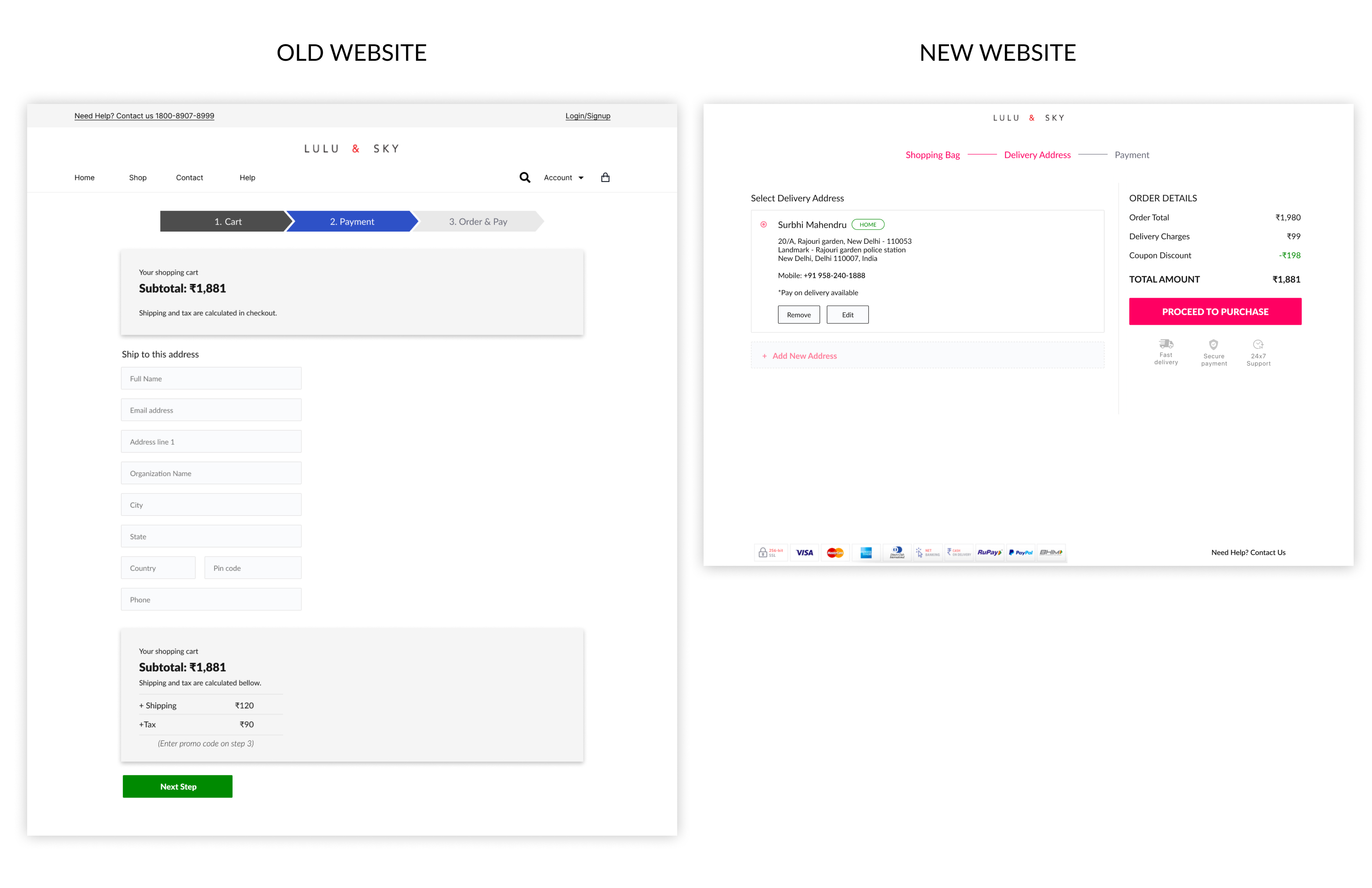
Solution: The shipping address form was shortened to keep just enough details in order to make successful shipping. ex: organization name, was skipped as it was not relevant here.
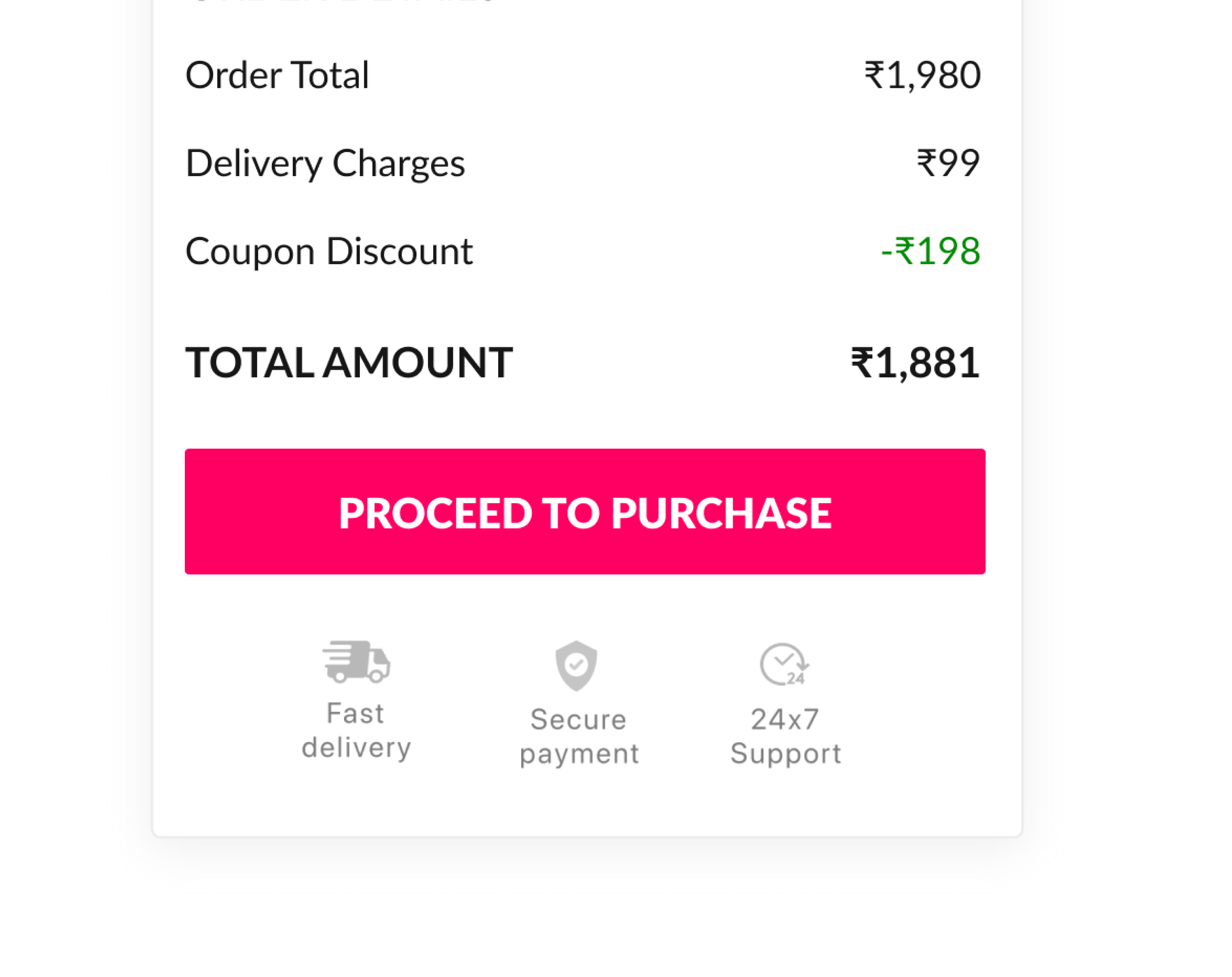
I have combined the order subtotal and order break up and placed them towards the right of the page. This not only saves the number of scrolls but also combines related information together.
For payment security and delivery support icons were placed below the summary, Now customer need not concern about security of their money as it is safe and sent through a secure payment gateway.
Payment page
1. Continuing on the similar layout of the shipping page, I have maintained UI consistency on the payment page as well.
2. Added the Address detail feature, which can be saved for future orders as well.
3. Added a feature of saving the card securely for faster checkout when the users return back for another purchase.
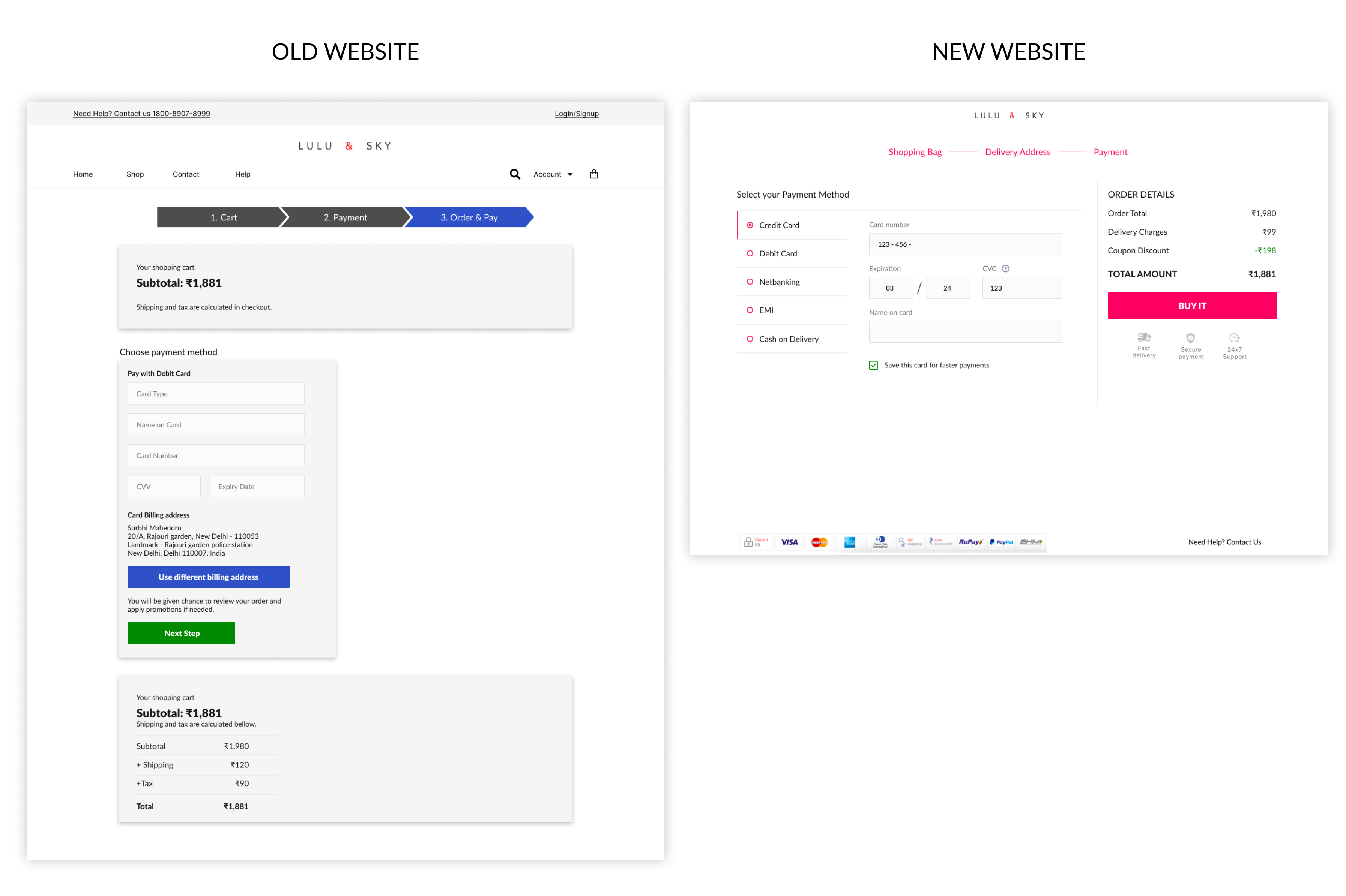
If the users wish to update either shipping or payment info, they can do so using the edit option provided on the review page. This would allow them to edit that information on a pop-up screen.
Measuring UX Success
In order to understand whether the design solutions have solved the user problems and have improved the overall checkout experience I advised that the following SMART Key Performance Indicators(KPI) must be reduced must be addressed to measure the UX success:
1. Time to complete order: The total time it takes for a user to complete a purchase should reduce to 2 mins compared to 5 mins earlier.
2. Shopping cart Withdrawal rate: No of people who are able to add the products to the cart but leave the website without making a purchase. The aim was to reduce the cart withdrawal rate to 10% from 29% within three months of launch.
3. User drop off from checkout: No of people who entered the checkout page after login but dropped out and did not complete their order purchase. The aim was to reduce the user drop off rate on checkout to 12% from 39% within three months of launch.
After three months of the website launch, we conducted the research again and found out that:
1. User experience was made a lot shorter and faster. One of the scenarios, at the payment page, the shipping form was extremely long which was shortened, in order to complete an order.
2. According to our surveys & A/B Testing, we noticed that cart withdrawals reduced to 9.7% (which was a big success)
3. Moreover, the user drop off rate on checkout also reduced to 13.6% which was very close to our original aim of 12%.
In order to reduce the cart withdrawals, I also suggested to support customers by calling them on their cell phones to provide personal assistance in case customer have unordered items in the cart.
In addition to these KPIs, the company saw an increase in sales over the last three months. Their previous website had an average of 350thousand visitors per month; now, the website has over 800thousand visitor per month and handling over 10,000 orders daily, according to data from the launch date. We considered this to be huge success.