E-commerce - Lulu and Sky
My Role
UX Researcher, UX Designer, Interaction Designer, UI Designer
Tools
Sketch, Figma, InVision, Zeplin, Sticky Notes, Pen & Paper, Airtable, Draw.io
Team
Myself, Founder, the business development manager, and a developers
Duration
6 weeks
UX Techniques Used
Competitive/Comparative Analysis, User interviews, Mind Mapping, Card Sorting, User Personas, Site Map, User Flows, Wireframing, Prototyping, Usability Testing
Challenge
Lulu and Sky mission is to give customers the best experience, beginning with the quality of products to design, pricing and customer service. It is the market mid-point between high-street fashion and luxury. The brand aspires to walk hand-in-hand with fashion and aims to deliver trends off the runway at affordable prices. They believe that fashion should be inclusive, and Lulu is all about providing a luxurious experience that’s also affordable.
The primary business goals for this website included:
• Having clear ways of locating specific products
• Ability to support a single page for each product
• Having an efficient means of purchasing one or more products
• Steering customers towards popular products.
Outcome
A high-fidelity prototype of a responsive ecommerce website with intuitive navigation menus and search filters, as well as an updated logo and brand identity.
Business Impact
After the website launched, the company saw more sales in two weeks than in the previous six months. Their previous website had an average of 350K visitors per month; now, the website has over 1 million monthly active users and handling over 10,000 orders daily, according to data from the launch date (9/11/2017) through 9/25/2017.
Process
PHASE 1: EMPATHISE
Process: Research Goals, Market Research, User Interviews, Competitive Analysis, User Persona, Empathy Map
Research Goals
To be able to give our users what they need, we knew that we must first empathize with them. By exhibiting compassion for their feelings, thoughts, behaviors, and needs, we were effectively able to identify our users pain points and solve design problems that came up. First was planning and research ramp up.
• Identify Lulu and Sky’s competitors, their strengths and their weaknesses
• Understand people's current experiences with clothing shopping
• Understand the role of clothing shopping in people's daily life
User Interviews
I went to local coffee shops to interview people within these personas about their shopping experiences. My objective was to learn more about their goals, needs, motivations, and frustrations.
Number of participants: 5
Gender: All female
Age: 20-45
Location of interviews: South Delhi
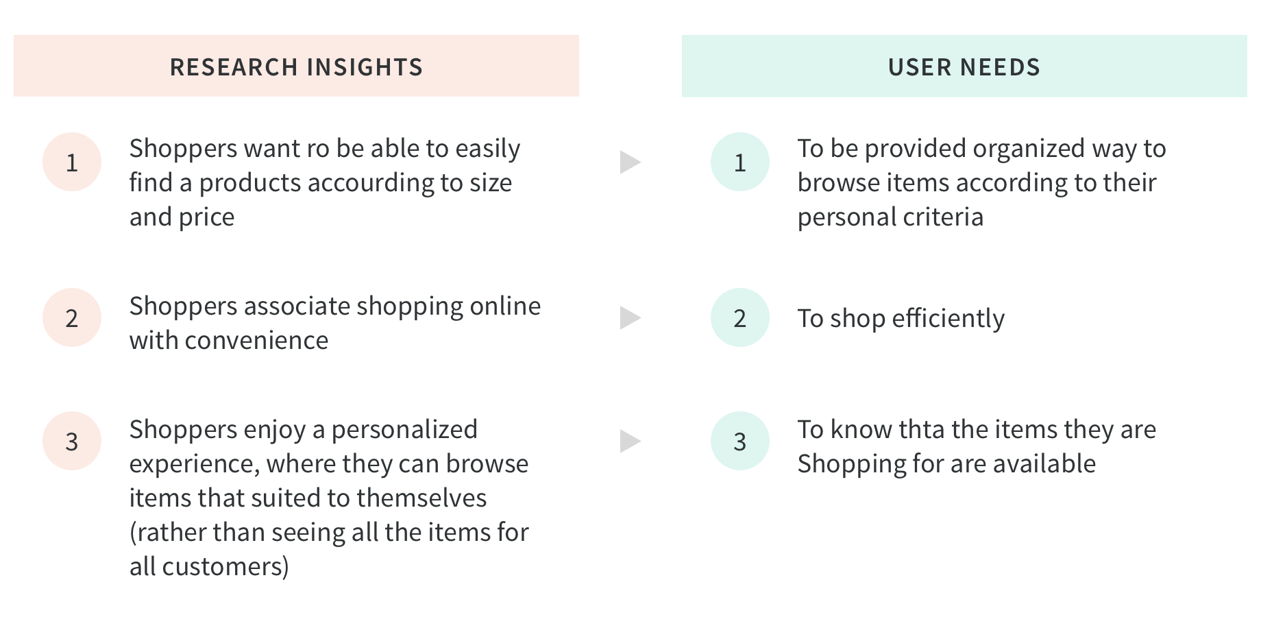
I found that participants associated shopping online with convenience and that finding exactly what they were looking for (be it size, style, or price) was often a challenge. When I asked about fantastic shopping experiences, participants mentioned having positive impressions of personalization options (narrowing down product listings to show only their desired size, style, or price range) and of customer service representatives who helped them find what they were looking for. The results here match with what I found in market research and I was able to gain a deeper understanding of why users want to have personalized shopping experiences.
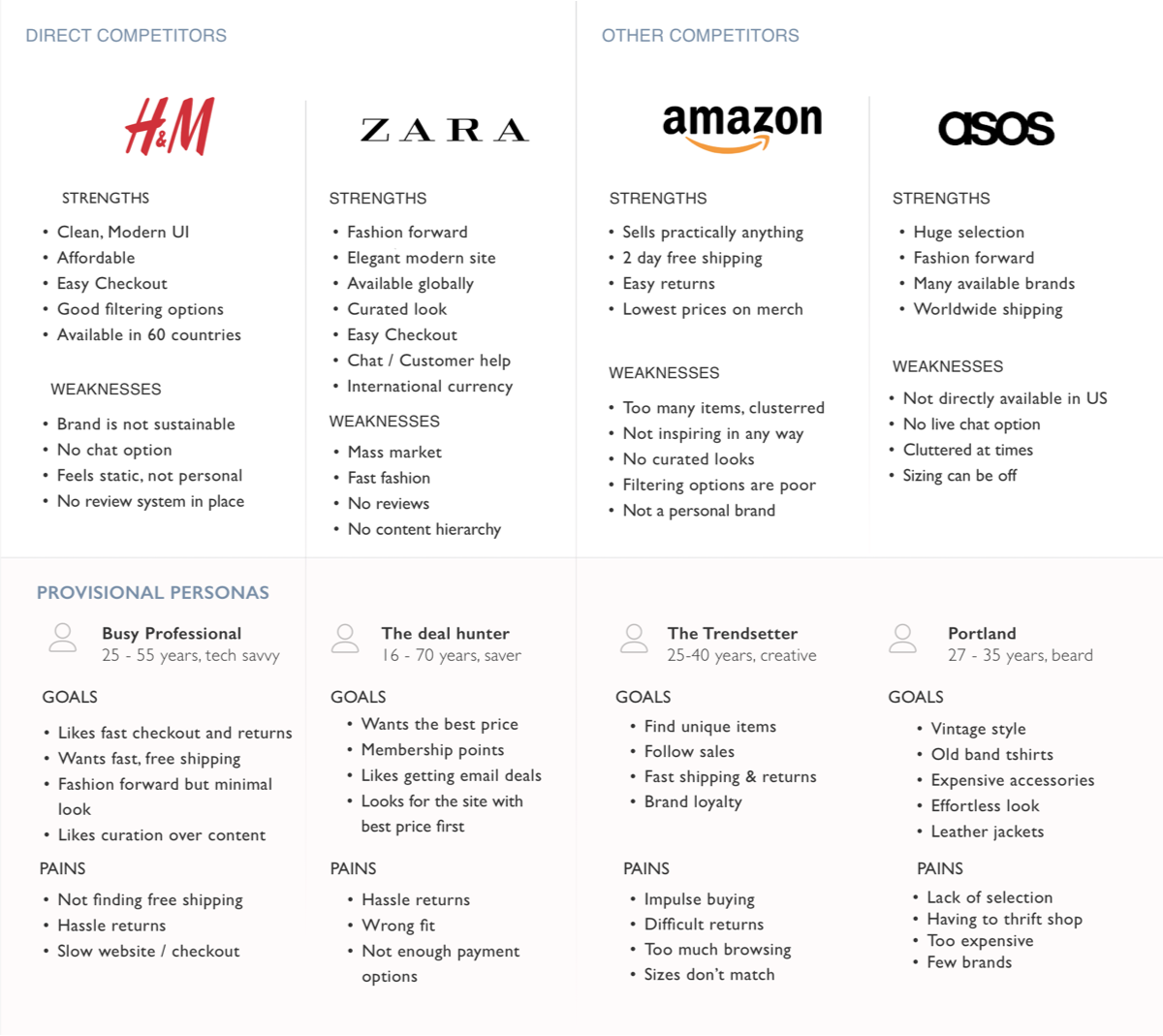
Competitive Analysis
To better understand how Lulu and Sky can uniquely position itself in the market, I analyzed the strengths and weaknesses of two direct competitors: H&M and Zara. I identified these brands as direct competitors because they are all fast fashion companies that offer similar products and target similar audiences as Lulu and Sky.
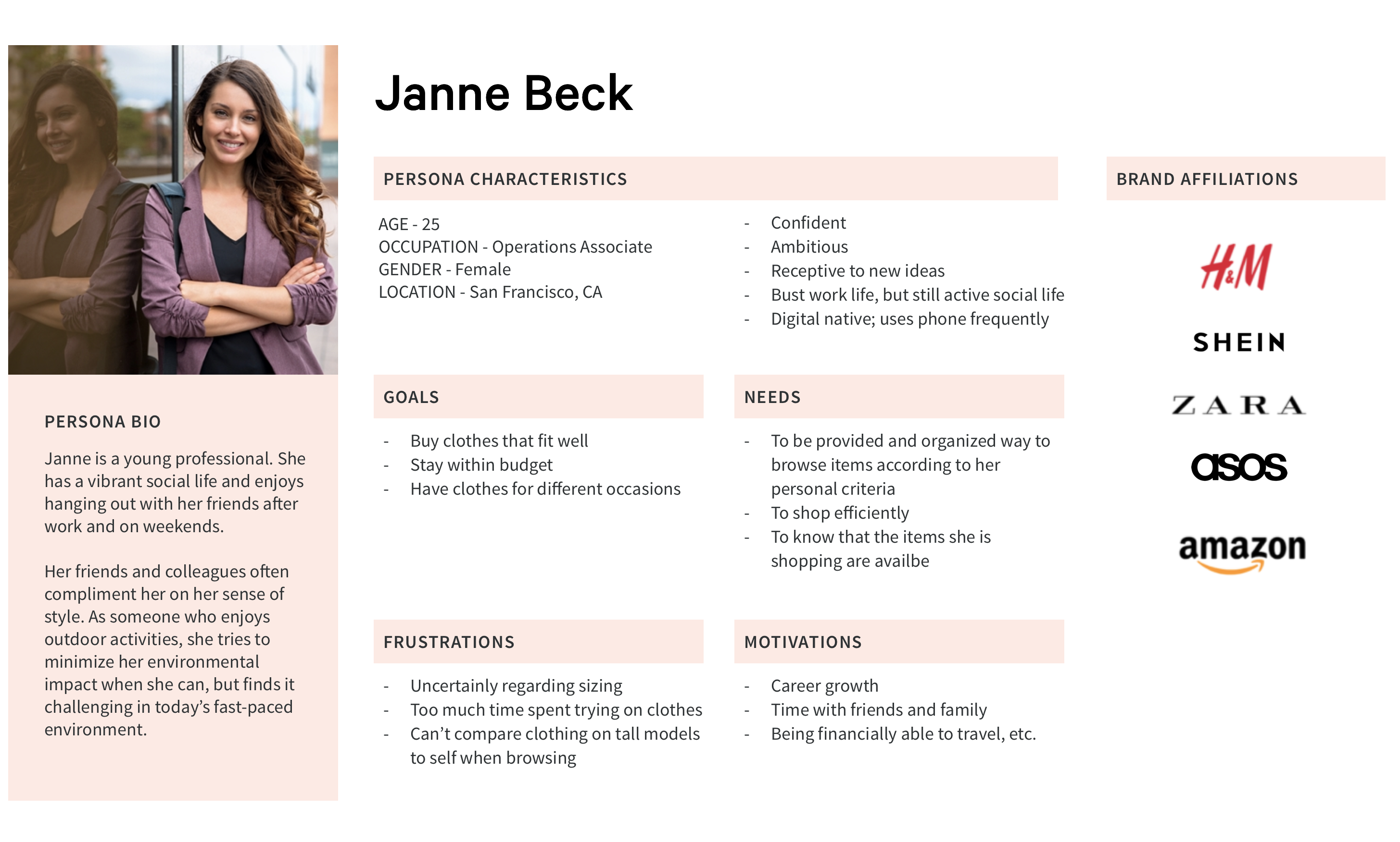
User Persona
Using those research insights and user needs, developed a persona as a representation of the website’s target audience – Janne Beck, a young professional. The goals, needs, frustrations and motivations were all derived from research insights.
This persona serves as a guideline for the rest of the design process – be it mapping out new features, creating a brand identity, or deciding on icon style for the website's user interface.
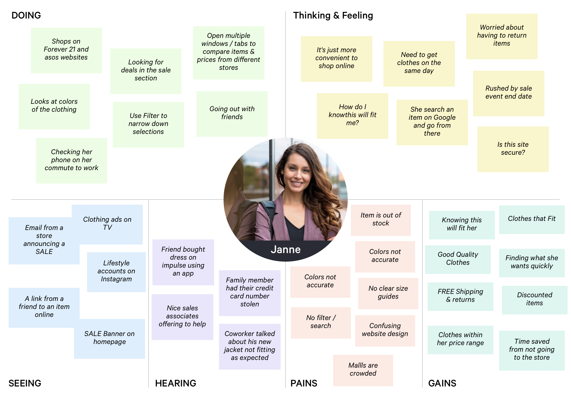
Empathy Map
Empathy maps are a great tool for understanding your users, organizing our research, and driving a human rather than technical view of a product or project. We create them to provide a proxy for the user during design and to ensure that the project team is in a human-centered mindset. It allows us to understand the broader influencers in user's lives. And by organizing our research into a coherent vision, this tool allows us to gain empathy with our users and to create a cohesive, empathetic view of them. Knowing how the user feels, how would they feel about this design decision?
PHASE 2: DEFINE
Process: Information Architecture, Open Card Sorting, Sitemap, Feature Roadmap, User Flow, Task Flow
Information Architecture
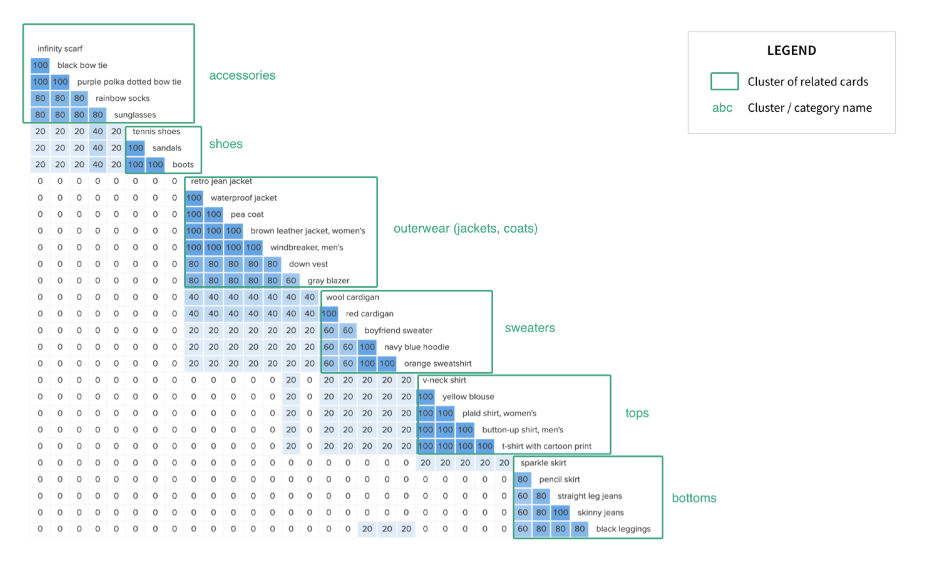
The next step of my process was to develop the navigation system by conducting a card sort, a user research technique to tap into people’s existing mental models. For this project I was given an inventory of 94 of the stores best-selling products to use as a guide. With such a large inventory, it was essential to organise this information in a clear and understandable way so that site visitors could find the products they’re looking for.
Open Card Sorting
Using an online open card sort activity, I identified categories to use for grouping clothing items in the website's navigation menu: tops, bottoms, sweaters, outerwear (jackets, coats), shoes, and accessories. See the card sort results bellow.
Sitemap
With the results of the card sort and inspiration from other competitor websites, I created a site map to define the overall structure of the website. This was to ensure that products were going to be placed where users would expect to find them when visiting the website and make the experience more intuitive.
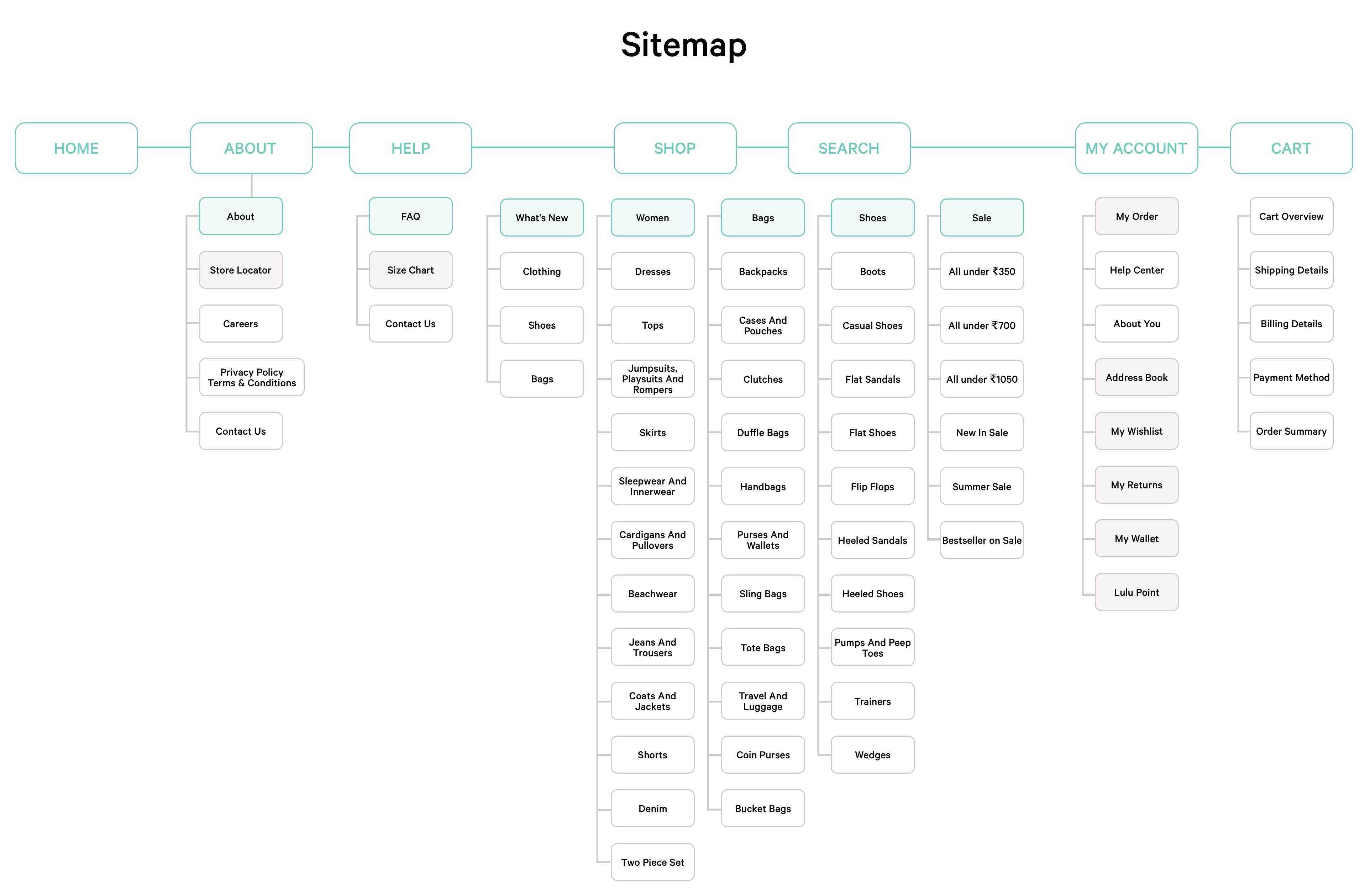
It’s important to clearly define the website’s navigational structure before creating any wireframes or designs. Otherwise, the project risks becoming inherently disorganized, running into scope creep, or having illogical navigation – all of which would result in an unpleasant user experience.
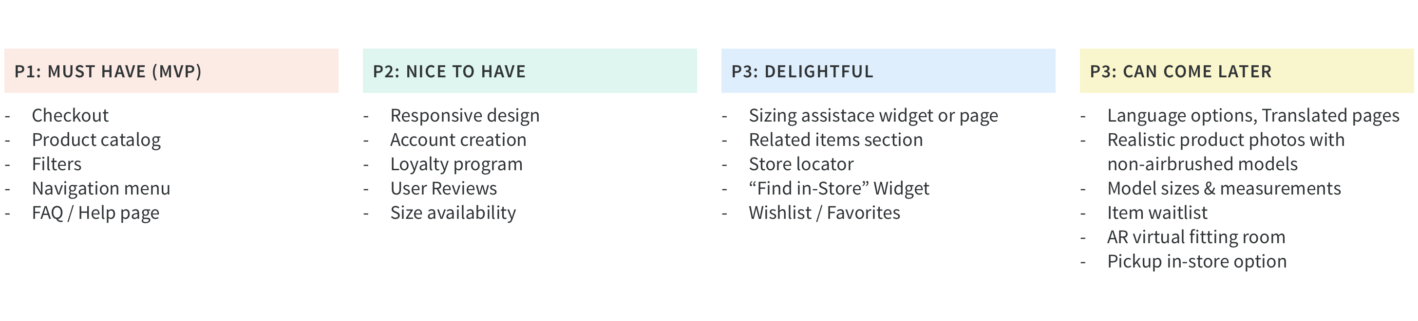
Feature Roadmap
To determine which features to prioritize in the website design, I mapped out various features according to how mission-critical they are.
Lulu and Sky’s mission is to sell clothing, so the Minimum Viable Product (MVP) for an ecommerce website must be able to showcase and sell products. Thus, the checkout flow and product catalog (and navigation menu, so users can find these pages) were set as first priority. I also included the FAQ/Help pages as Priority 1 because Lulu and Sky’s reputation is based on its phenomenal customer service.
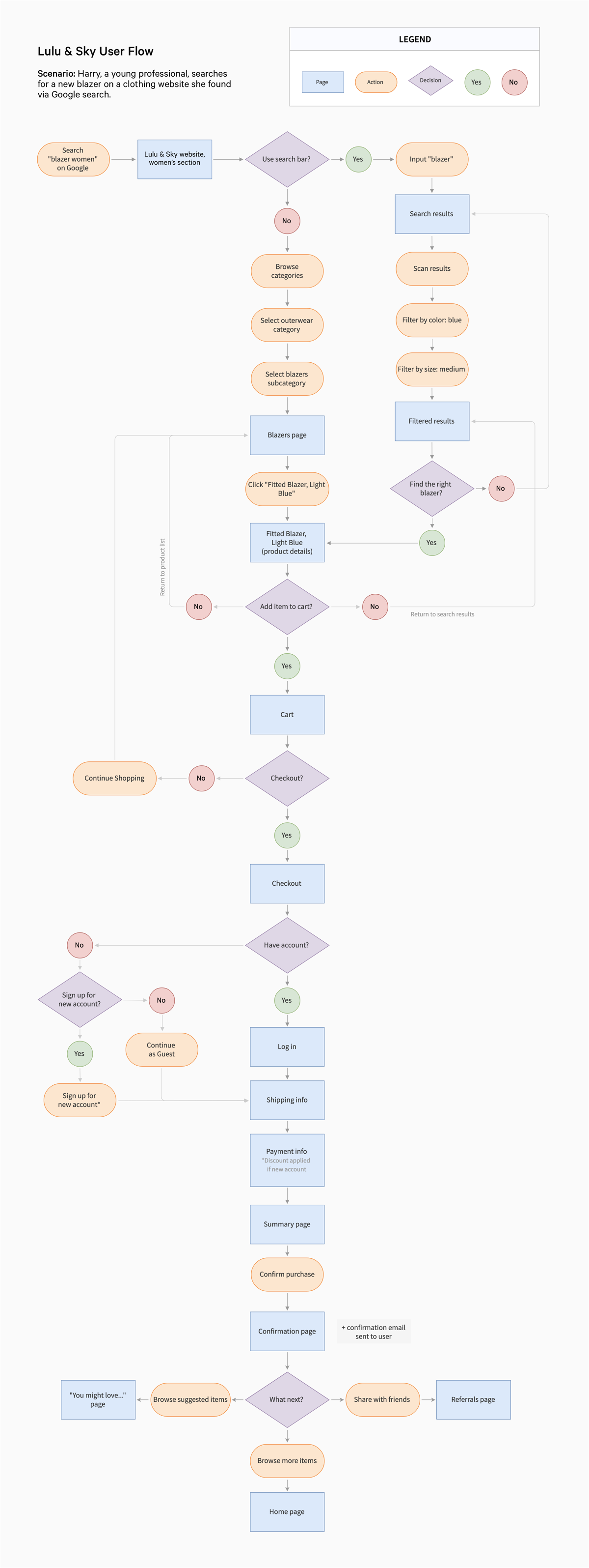
User Flow
This user flow walks through the process of landing on Mirror’s website from a Google search, finding a particular item, and purchasing that item. The choices available at the end of the checkout process allow the user to continue to interact with the website, so that with the brand doesn’t stop at purchase.
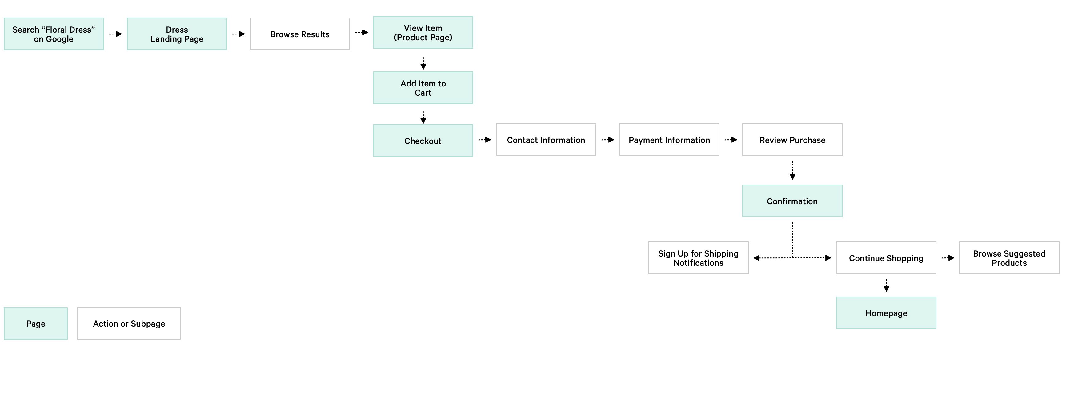
Task Flow
I took one of the branches from the user flow and outlined a task flow as a way to map out the individual pages that I need to design.
PRODUCT REQUIREMENTS
Then I created the Product Requirements to highlight the features that I believed to be most important so that I would know what features to include in the first roll out of the product.
PHASE 3: IDEATE
Process: Sketches • Low-Fidelity Wireframes
Lo-Fi Wireframes
I sketched some versions of Mirror’s homepage to explore how to layout various types of content, such as featured products and product collections.
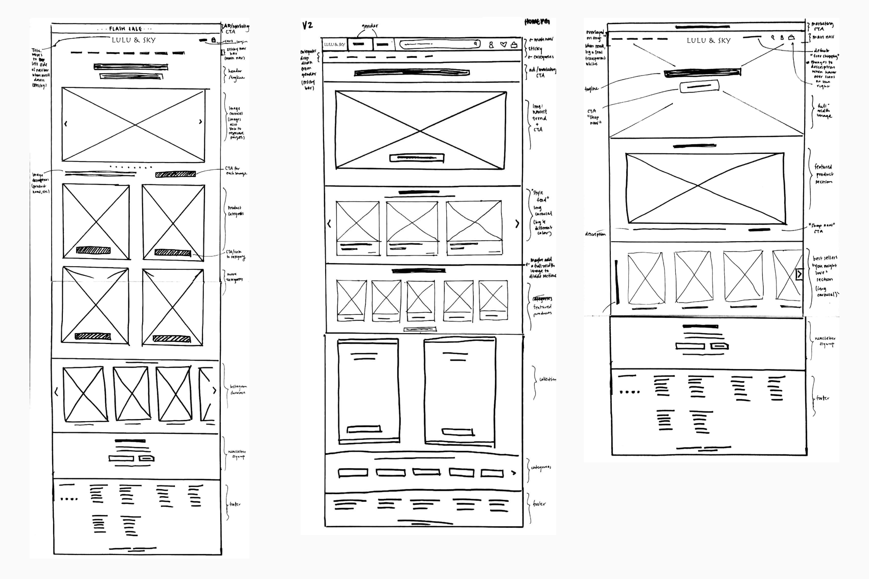
While sketching each feature/component, I thought about how the content and its placement would help Janne (our persona) achieve her goals, meet her needs, and avoid her frustrations.
PHASE 4: DESIGN
Process: Mid-fidelity Wireframes • Branding & Logo Design • UI Kit • High-Fidelity Wireframes
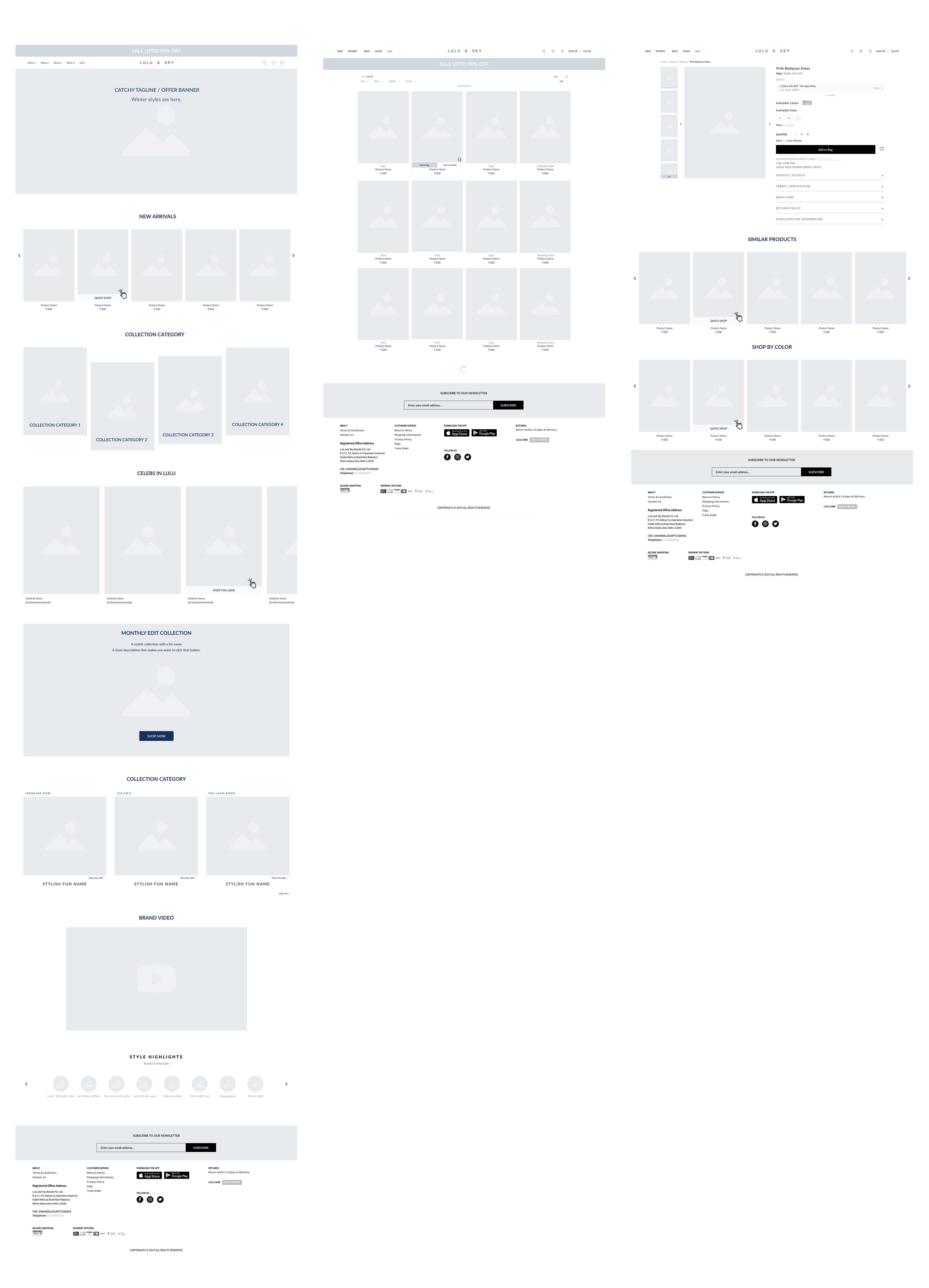
Mid-Fidelity Wireframes
Once we agreed upon a design language that resonated with us and aligned with users expectations, I created mid fidelity wireframes in Sketch.
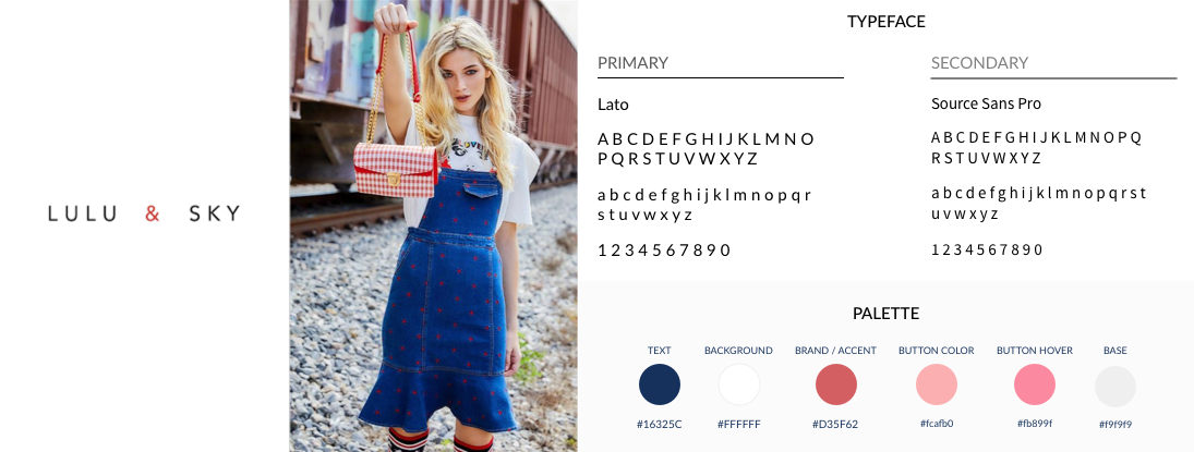
Before adding detailed content and color, I put together a brand style tile with an updated logo in order to set guidelines for color and imagery.
Branding & Logo Design
I started by listing out adjectives that describe Lulu and Sky’s image and searched for colors, imagery, typography, and logo designs that conveyed those ideas.
With the logo design finalized, I created a brand style tile with images, typography, and a color palette. The colors reflect Lulu and Sky's brand image: modern, fresh, neutral.
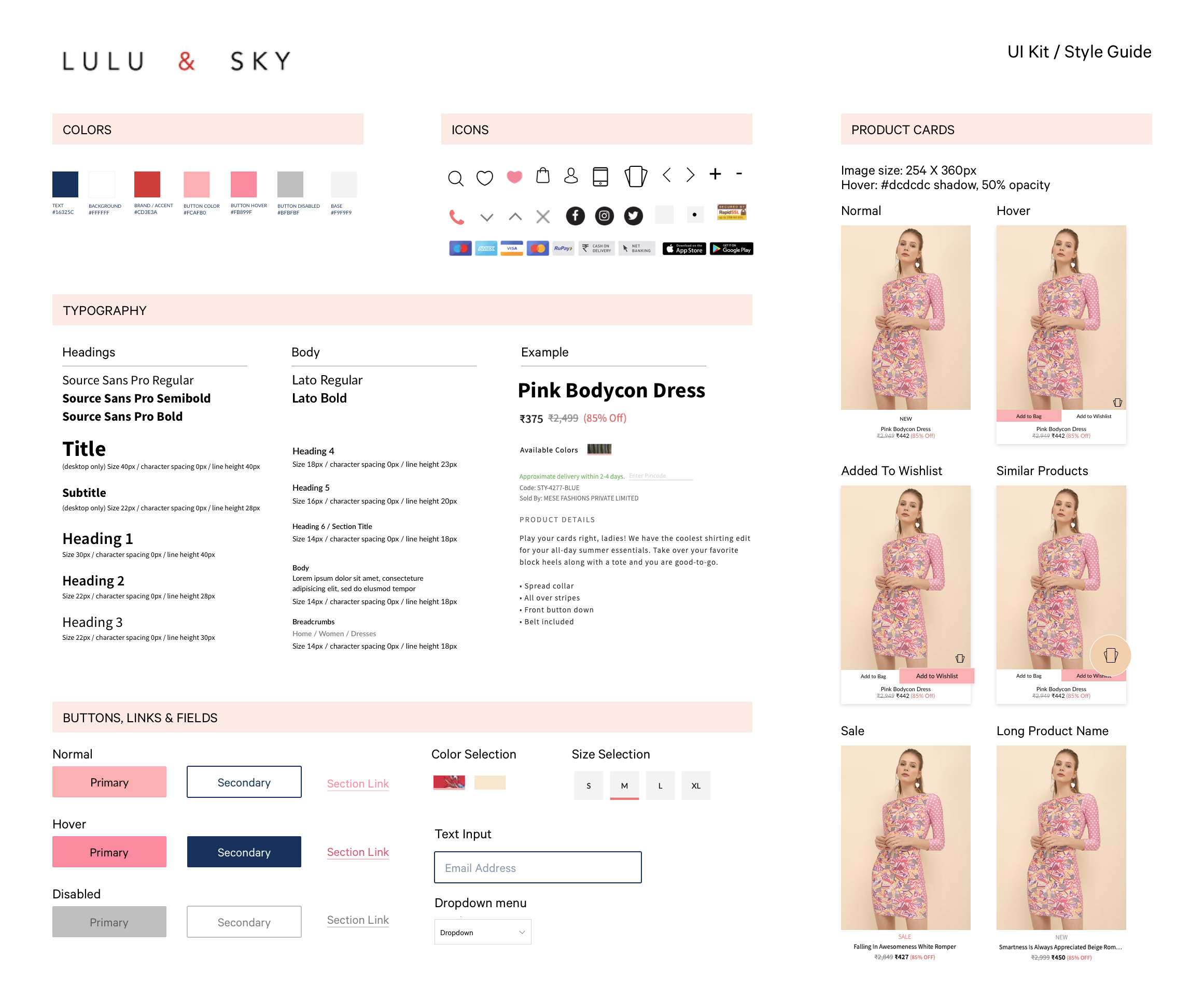
Ui Kit
I created a UI kit using the brand style tile to maintain consistency between the brand and the website while designing the rest of the UI.
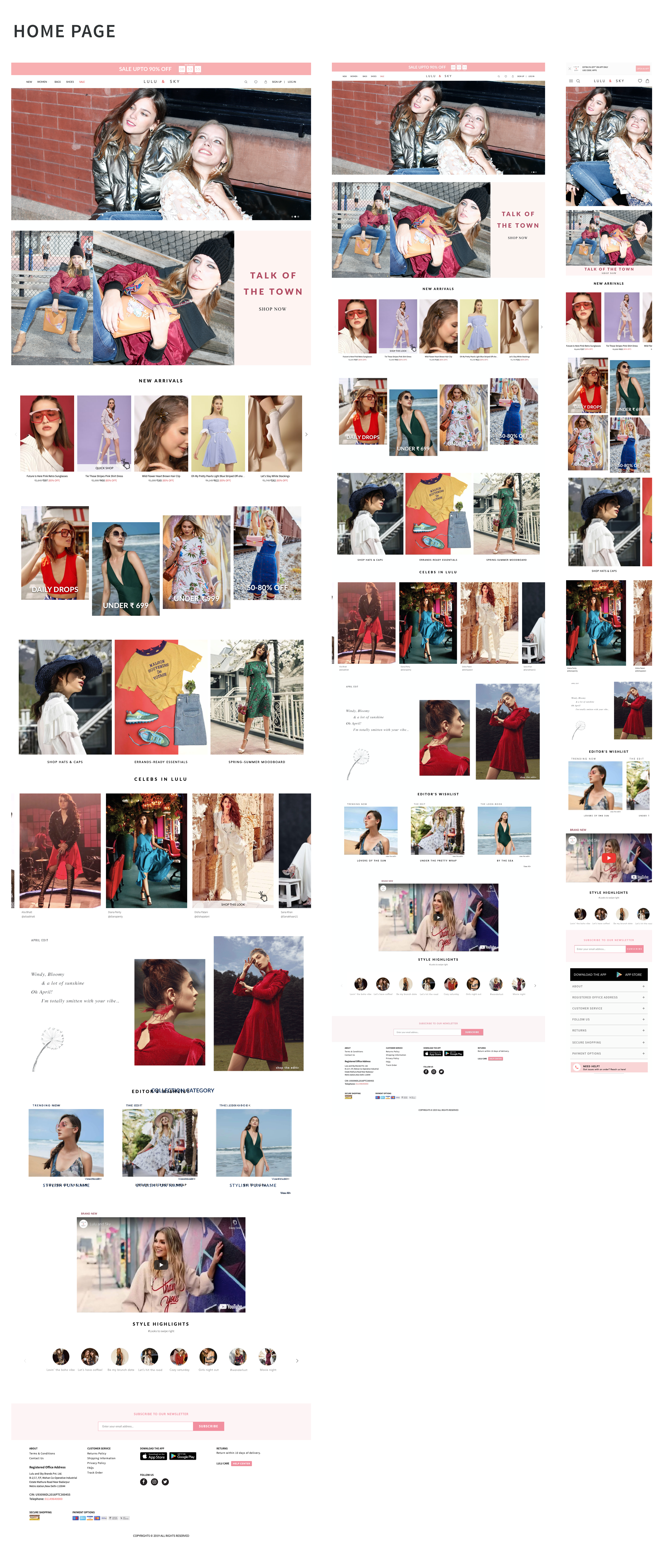
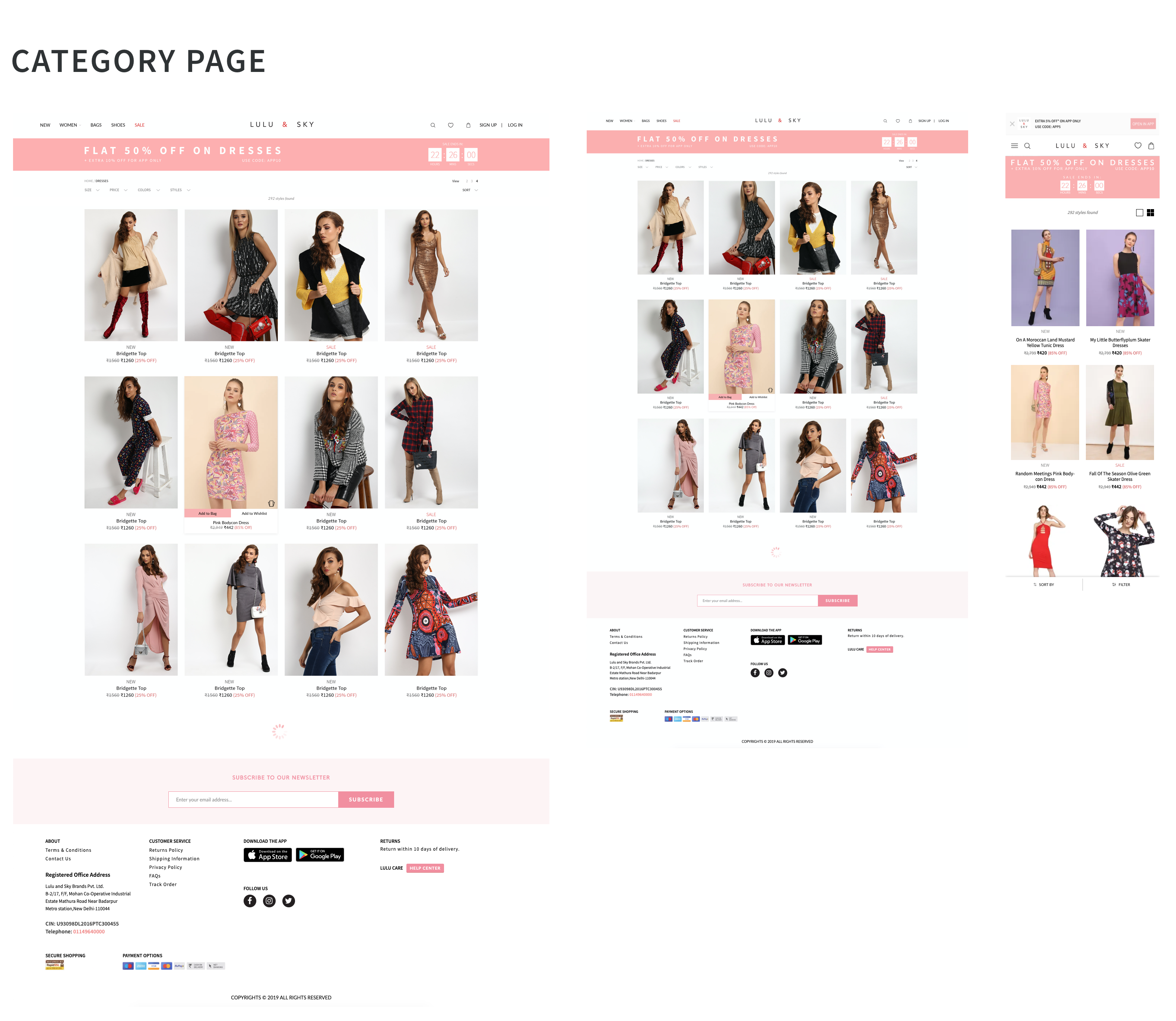
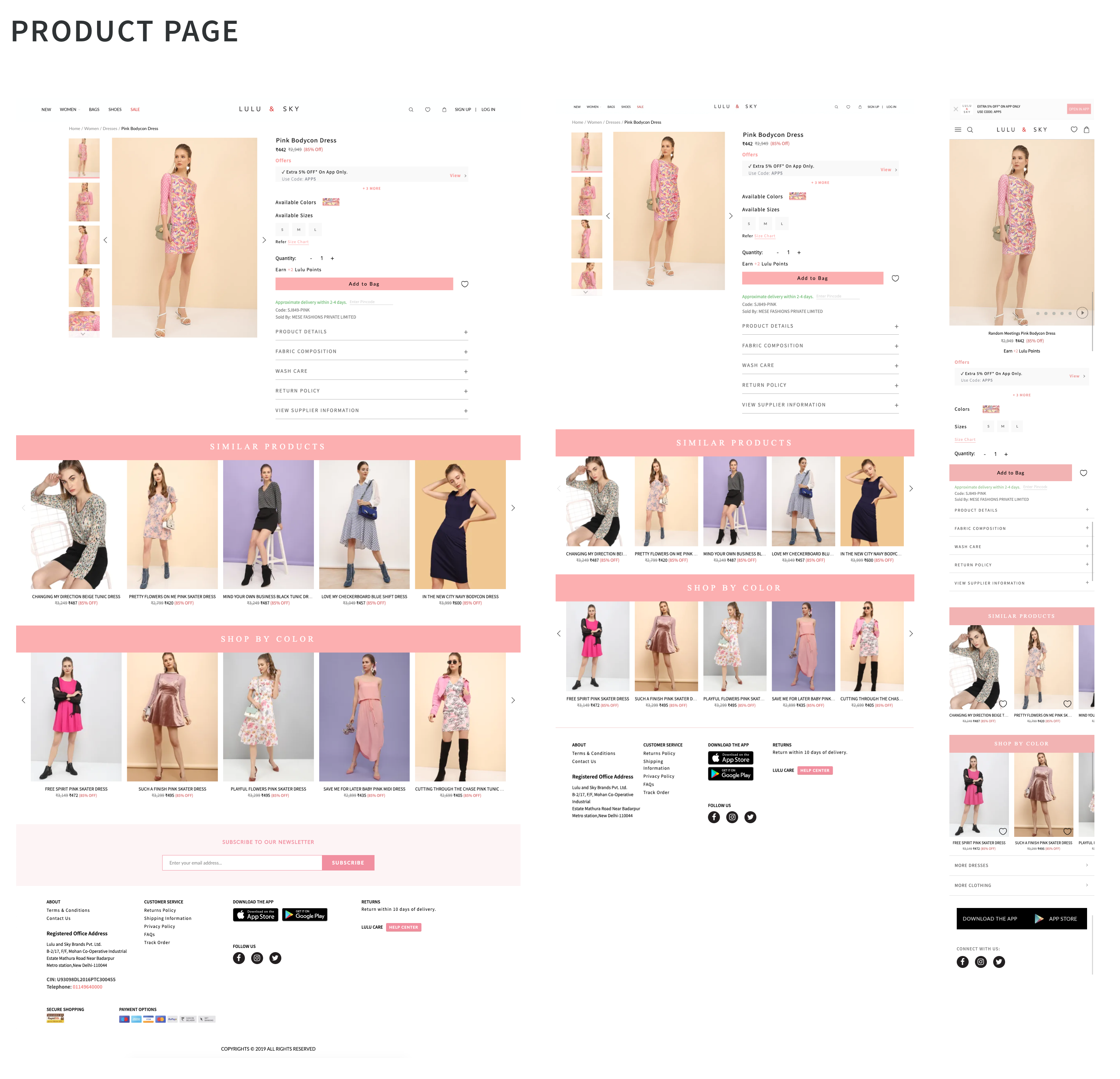
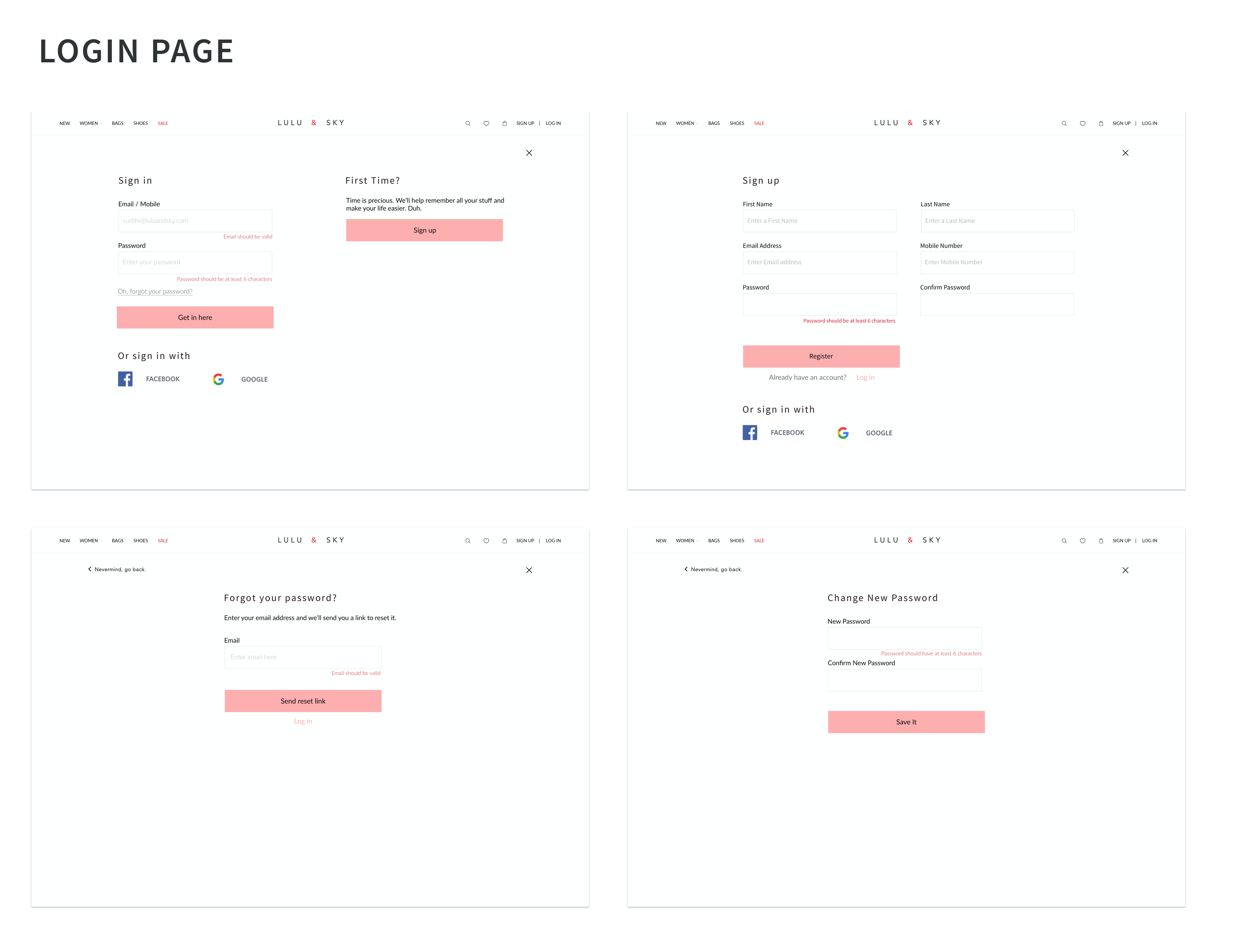
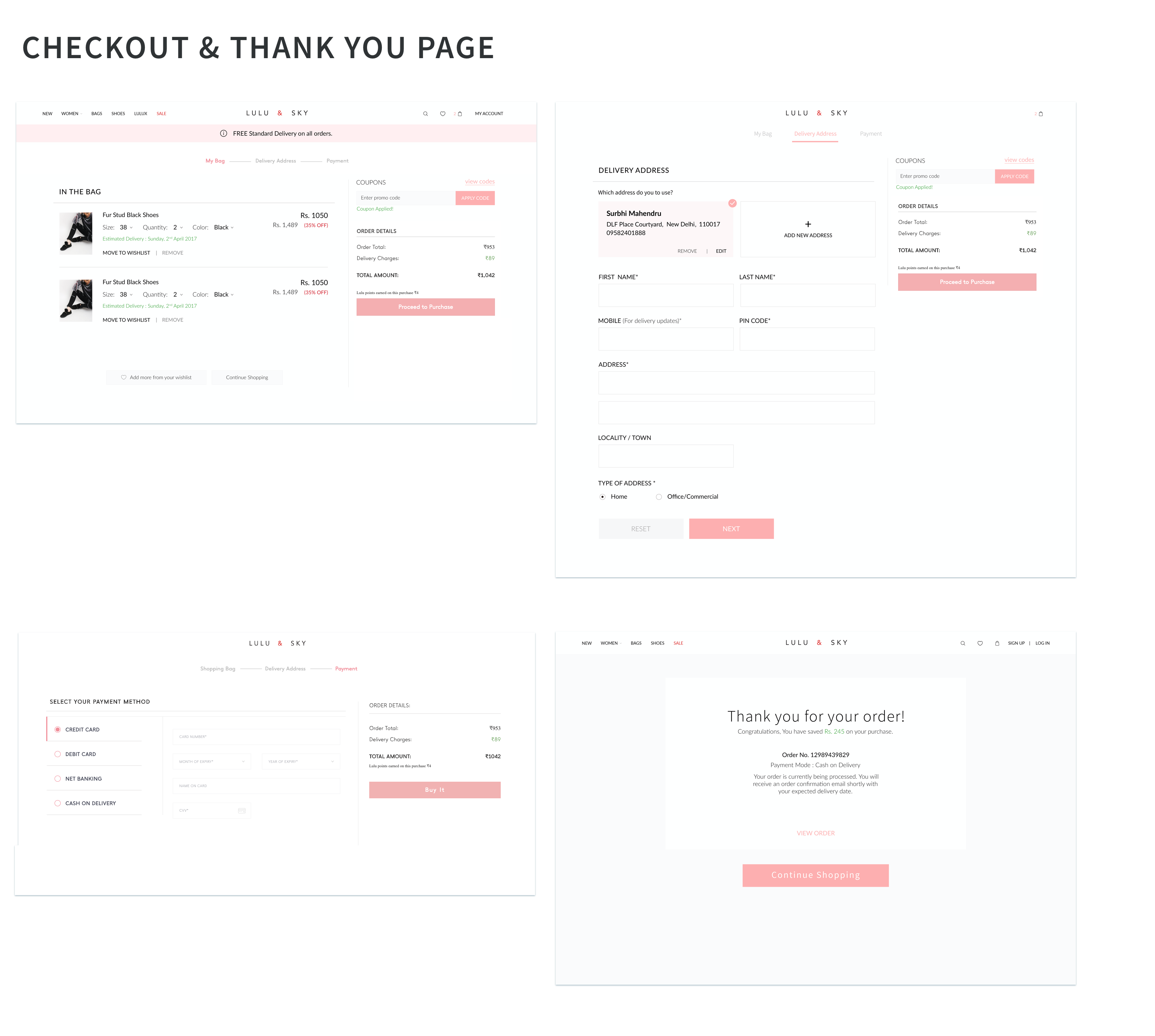
High-Fidelity Responsive Wireframes
With the branding and style set, I moved on to designing the high-fidelity responsive wireframes for the homepage and product page.
PHASE 5: PROTOTYPE
Process: High-Fidelity InVision Prototype
My next step was to create a clickable prototype using inVision. Prototypes allow us and our users to get a quick idea of the project without actually hard coding the design. You can view the prototype in Invision by clicking the button below.
View prototype ↗PHASE 6: TEST
Process: • Usability Test • Synthesis (Affinity Map)
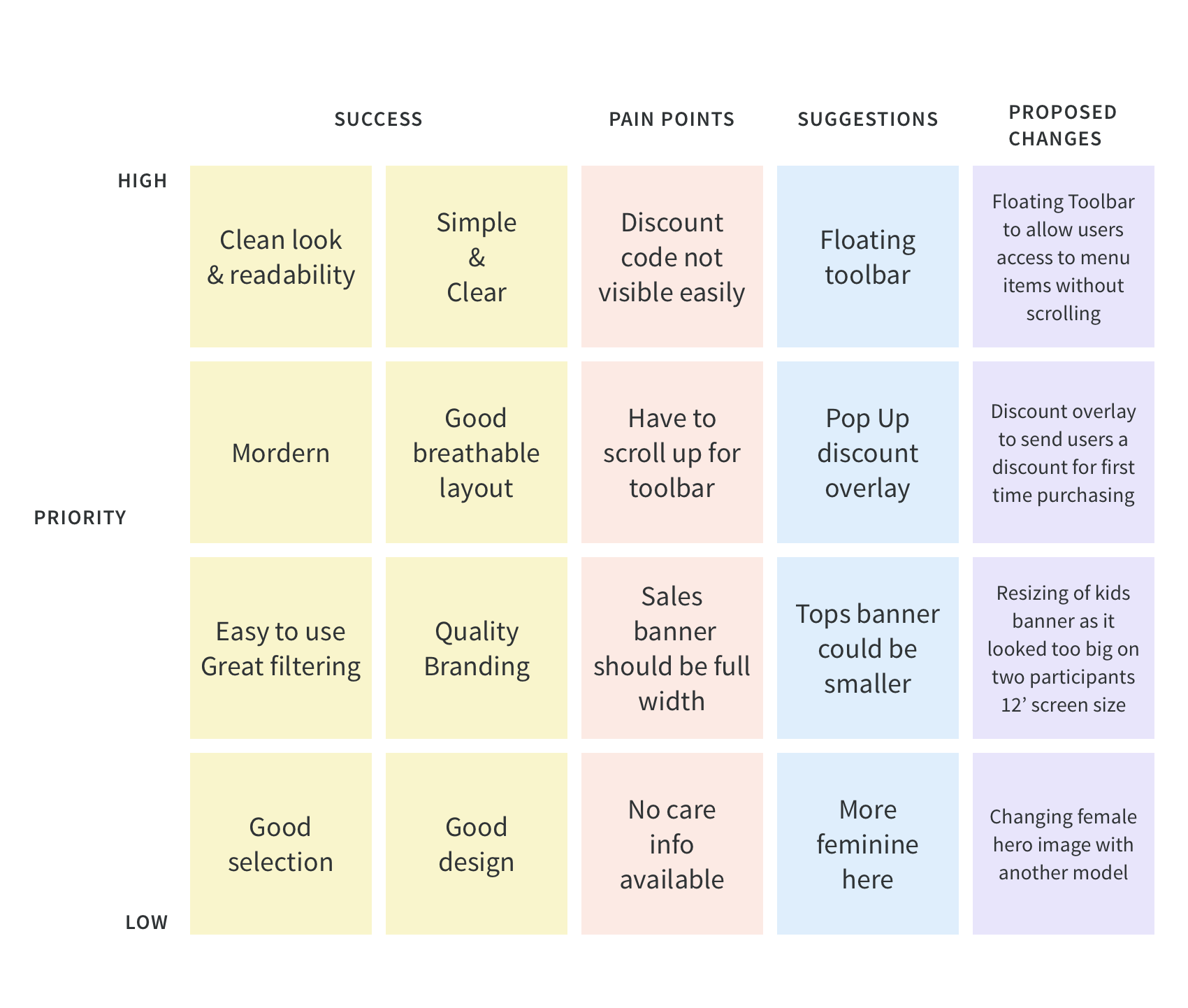
USABILITY TEST
I conducted usability tests for the Lulu and Sky website with several participants. I interviewed a total of 4 participants. Each participant liked the layout of the pages, font sizes, pictures and cleanliness of the page. There were specific comments about some design choices. As result, I gathered valuable qualitative insight on how users completed tasks on the Lulu and Sky website.
100% of participants liked the layout, font sizing, pictures and aesthetic of the site.
50% said they would prefer for the sale banner to be full width
50% needs easier access to the toolbar, 25% suggested a floating toolbar
75% wanted to get a promotional discount at first glance, preferably as a pop up overlay.
As I synthesized findings from our usability testing, I was able to find out where the pain points of the users were stemming from and what could be further improved. The affinity map visualizes these results.